
Change widget type
Change a widget's type (Chart, Table, or Scorecard) and, for charts, its chart type, to best visualize trends, comparisons, and proportions in your data.
Why does the widget type matter?
The widget type is how a widget displays its data, and changing it affects only how data is shown, not how it is calculated. Indicate has three widget types:
Chart: visualizes data as a line, area, bar, column, or pie. The specific style is called the chart type.
Table: shows values in rows, ideal for detailed numbers.
Scorecard: highlights a single key metric (KPI) at a glance.
Choosing the right widget type helps you highlight patterns, trends, and comparisons in your data more effectively.
Highlight trends over time with line or area charts.
Compare categories with bar or column charts.
Show proportions or shares with pie charts.
Display key metrics at a glance with scorecards.
Review detailed values with tables.
Note:
Changing the widget type only affects how data is displayed, not how it’s calculated.
You can experiment with different widget types to find the one that best fits your story.
When changing from one chart type to another (for example from line to pie), check that the selected dimensions and metrics still make sense for the new view.
Some visualization options depend on the selected widget type. For example, Stacked and Smooth are only available for specific chart types.
How to change a chart type
Go to
Analyticsand open yourdashboard.Click on the
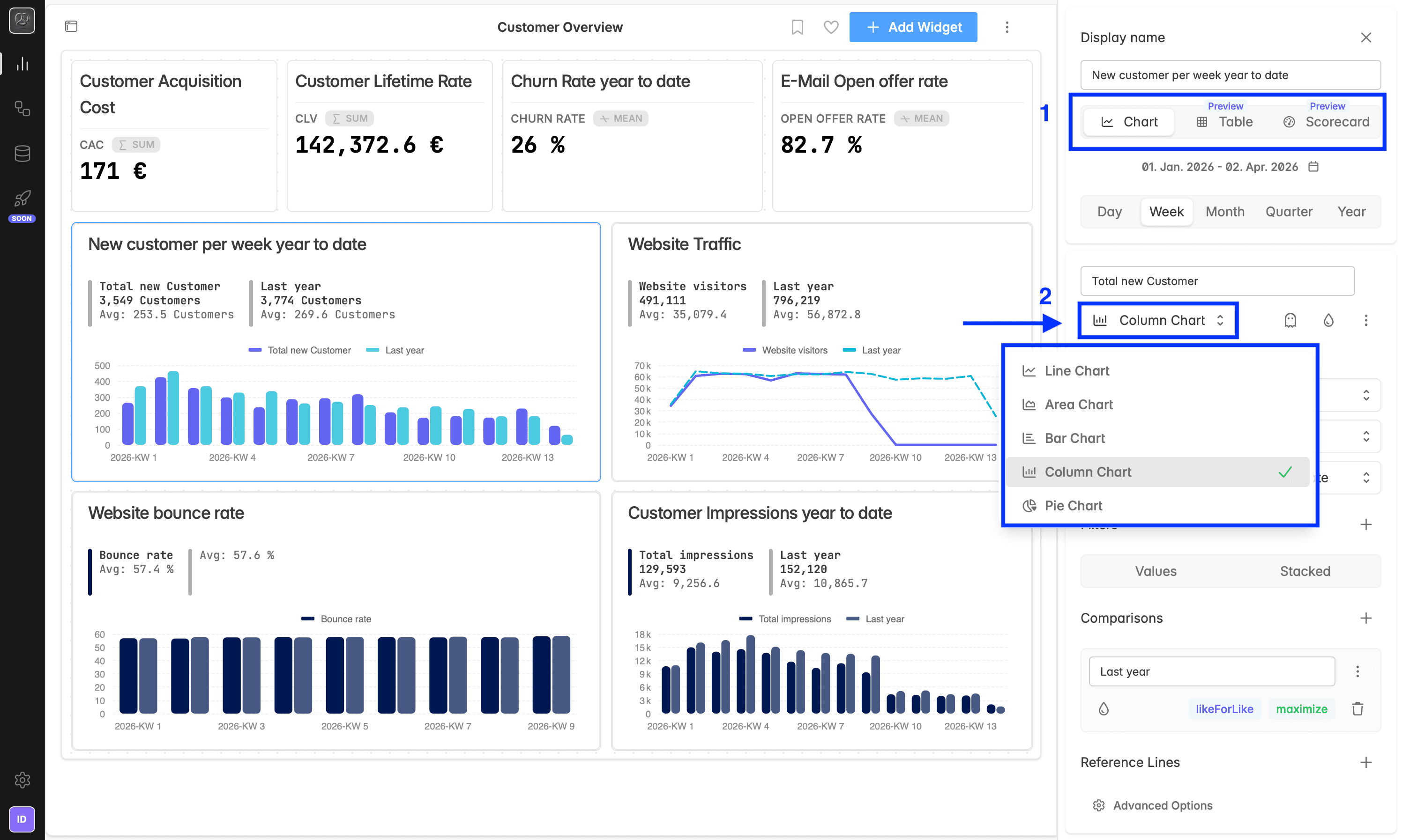
widgetyou want to modify. The widget designer for that widget opens in the right sidebar.First, decide on your visualization format in the right corner under your display name:
Chart: displays data visually (line, area, bar, column, and pie)
Table: shows data in rows
Scorecard: highlights a single key metric
Changing the chart type (Chart only)
When the widget type is Chart, you can also set the chart type for each metric. Table and Scorecard do not have a chart type selector.
In the widget builder on the right-hand side, find the chart type field under your metrics/KPIs name (for example, Total Users).
Click the chart type dropdown, the current type (e.g., Line Chart) will be highlighted.
Choose a new chart type from the list:
Line Chart
Area Chart
Bar Chart
Column Chart
Pie Chart
The visualization updates instantly in the preview area.
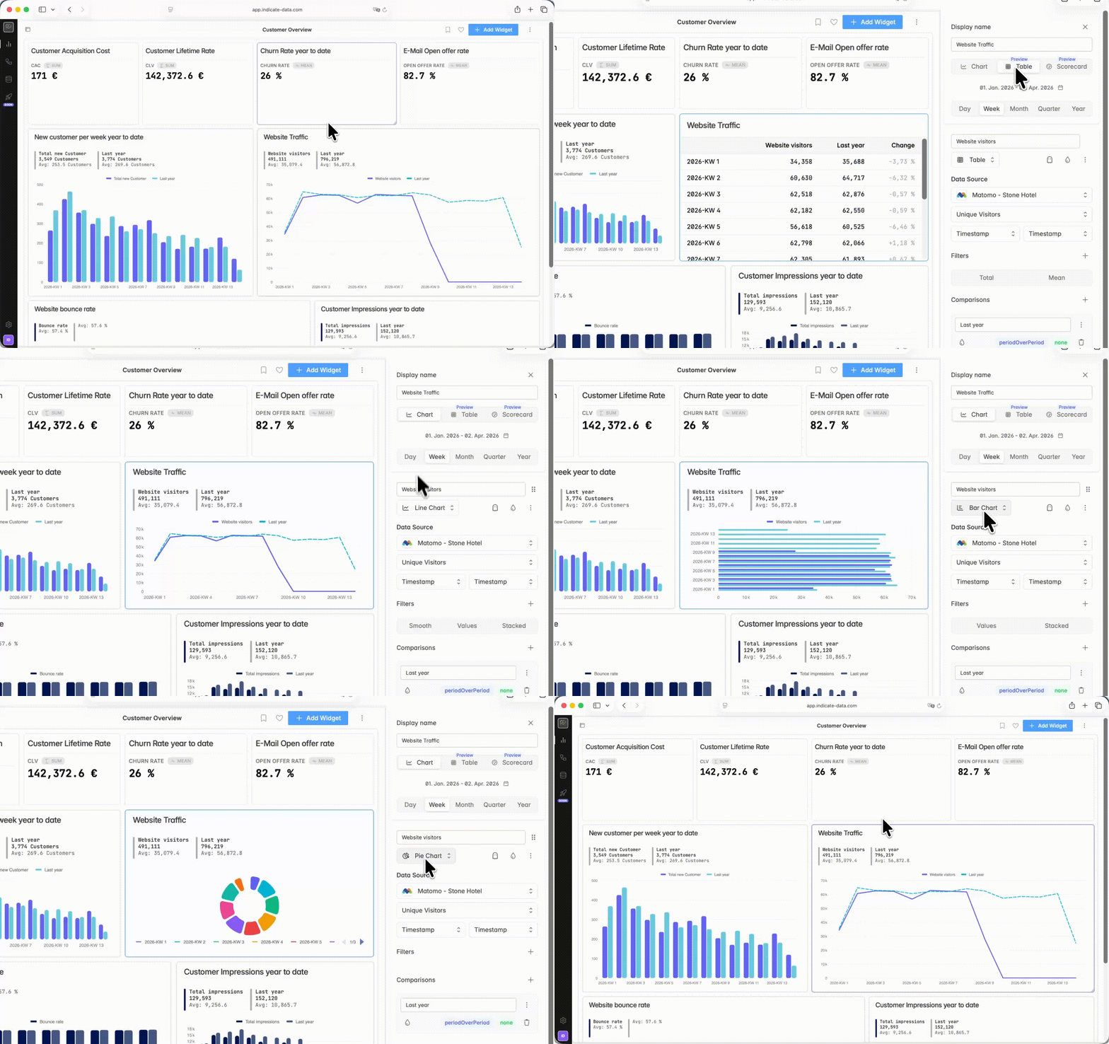
You can change the widget type for an individual metric within a widget, allowing you to combine different visualization types in the same chart. However, keep in mind that not all chart types can be combined, as some visualizations support different parameters and display styles.
How do I use a scorecard?
A scorecard highlights a single key metric (KPI) at a glance. It shows the current value and lets you compare it with a past period, so you can spot trends quickly.
Create a scorecard from scratch
In your dashboard, click
+ Add Widget.Choose your data source (for example Google Analytics 4) and the metric (for example New Users).
Click Save.
In the widget editor, switch the widget type to Scorecard using the icons in the top right (next to Chart and Table).
Under the calendar icon, select the time range (for example Year to Date).
In Display name, enter a clear title (for example New customers YTD).
Convert an existing widget to a scorecard
Open the existing widget by clicking on it.
In the widget editor, switch the widget type to Scorecard using the icons in the top right.
One scorecard or several?
You can put several metrics in one scorecard, or split them across multiple scorecards depending on what reads best. If you later switch to a Chart, the grouping makes a difference.
You can also add comparisons and format values on a scorecard. See Add comparisons and Change formatting.
How do I create a table?
A Table widget shows your metric values in rows by time period and lets you compare them to one or more reference periods.
Create a Table widget
In your dashboard, click
+ Add Widget.Select your data source and metric.
Click Save.
In the widget editor (top right), switch the widget type to Table (grid icon).
You can also add comparisons and format values on a scorecard. See Add comparisons and Change formatting.
Export.
To download a table as CSV, click the arrow icon in the top right corner of the Table widget.
Troubleshooting
The chart type dropdown isn't showing.
The chart type selector appears only when the widget type is Chart. Table and Scorecard do not have it. Switch the widget type back to Chart to pick a chart type.
My chart looks wrong after switching type.
Some chart types expect different dimensions. When you switch, for example from line to pie, check that the selected metric and dimensions still make sense for the new view.
Smooth or Stacked is not available.
These options are available only for specific chart types (line and area). Switch to a supported chart type to use them.
What if no widget type is selected?
For very old widgets, it can happen that no chart type is selected because the widget was created in an older version of Indicate where not all widget types were available. To keep working with the widget, select a chart type by clicking one of the options. The widget is most likely a line or bar chart, but the migration might not have pre-selected the chart type for very old widgets. Once you select one manually, everything should work again.
Was this helpful?